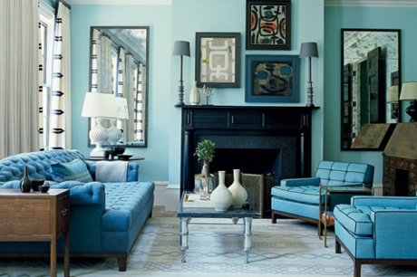
Going monochromatic when designing your home can be an easy solution to creating your space, instead of trying to piece together a complex palette of complementing colors. Monochromatic doesn’t just mean black and white! Monochromatic colors are all the colors (tints, tones, and shades) of a single hue. It’s a way of using one color’s gradient of tones to build layers and dimension in the room.

There is a science to creating monochromatic color schemes. But if you are really interested in creating this kind of feeling then my suggestion would be to narrow down the color choices to three shades of the color. If you are going for a very light and airy feeling, then, choose the three colors on the lighter side of the gradient. Choosing colors in this way removes all harshness in the room. Any furniture that uses the darkest color in the room make it the main focus of the room. Everything else is just background noise with the use of delicate accessories that don’t attract attention but still creates light and depth enough to break up the colors.

If you are looking to create a contrast between light and dark (the most common choice), then, choose the first, the middle and the last colors in the above gradient. Using a light color wall, a mid-tone for the furniture, and a dark color in the accents can create a really nice balance.
If you are going for a darker more dramatic feeling, then, go for the last three colors. What makes a darker space work is breaking up the dark shades with pops of white and natural lighting. It can be dark and dramatic without feeling like the inside of a cave. Like the living room example above, you have to keep in mind of your natural light. At night, instead of having this muddled dark room, your eye will focus on the pops of white.
